this girl drives a tank
a web log by bzgirlNovember 24
sometimes flash isn't bad
I know in the past I have spoken about how much I dislike Adobe's flash as design tool in a website. As a toy, its pretty decent actually, plenty of websites use it just to display embedded movies or silly games or even sillier cartoons. Beyond that it seems. at least to me, to fail as a technology to deliver meaningful content.Forgetting the proprietary format for a moment, what kills flash is the inability to link to specific pages, horrible implementations of flash `portals', (a stupid way to greet a visitor), and cheap and tacky way to make up for lack of content. Not to mention hideous blinking ads that are now all the rage.
Architects, photographers and advertising agencies lead the pack in the `flash looks cool, lets use it' department, without thinking about how crappy the end user experience is.

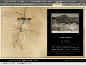
Theban Mapping Project is probably one of the best uses of flash I have ever seen, the site has the advantage of course of having a boatload of content, and to be fair, a really interesting topic. (who isn't fascinated by Egyptology?) When you launch the `atlas', click on the 3D Tomb button, you could spend hours just in that section...
Here is a flash site that despite good intentions doesn't fare so well :-)
Posted by æc♥ | Permanent Link