Lighting
BRL-CAD's rt ray tracer automatically provides light sources if none are defined in a scene being rendered. Additionally, 30% of the light in a scene goes towards ambient illumination so that all objects in a scene are visible. The default lights are automatically provided so that default renderings show users 'something' rather than nothing.
That said, there are many situations that call for custom lighting where you want to make an image brighter or darker or where you want to illuminate a portion of the scene in some particular manner. To do this in BRL-CAD, you create a combination object that has the 'light' material property set.
If you render a scene with any lights, the default lights will be disabled. The default ambient lighting will still remain at 30%, and is a parameter controlled by the -A option to rt.
BRL-CAD supports a wide variety of light types including the ability to represent directional lights, point light sources, colored lights, area lights, and more. Lights are visible by default but may be marked invisible for situations where you want to more heavily/specifically illuminate a portion of a scene without seeing the light object itself.
A Simple Example
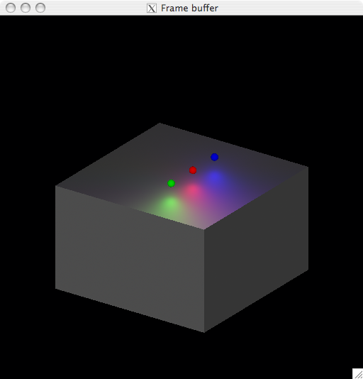
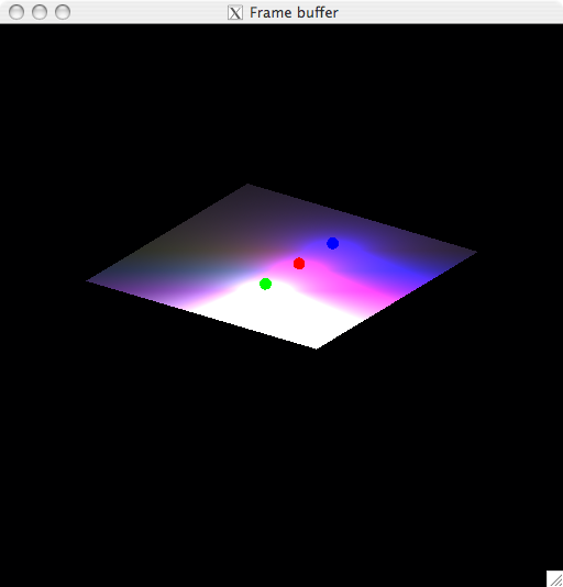
Consider a simple scene comprised of a box with three colored lights positioned above the box:
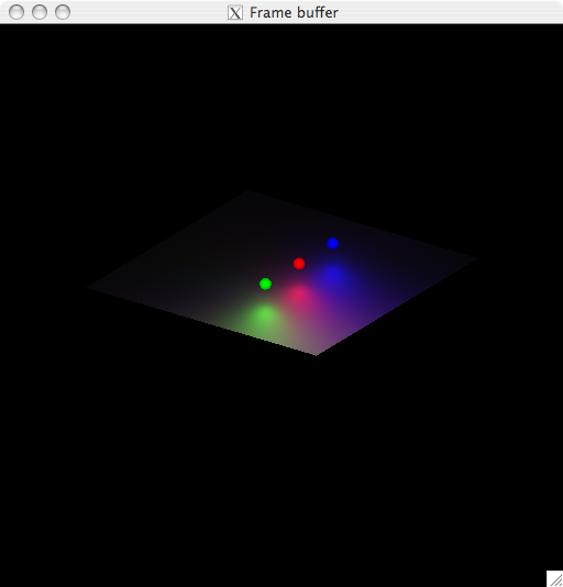
The default ambient illumination allows the entire box to be visible even though the light sources clearly do not illuminate the sides or bottom of the box. By default, the 30% of the illumination in a scene goes towards ambient lighting. If we set the ambient light contribution to 0% (via rt -A0), only the top of the box is illuminated as we would expect.
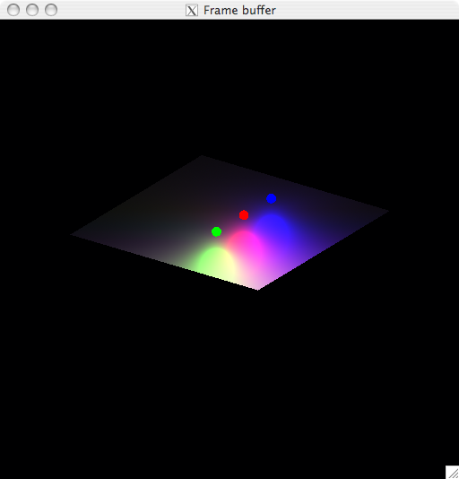
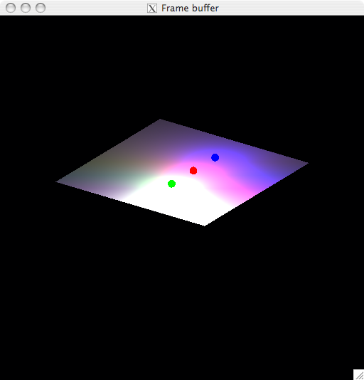
To fully control the lighting for a given scene, ambient lighting should be turned off (via rt -A0) or at least set to a low value (e.g., rt -A0.1). Without ambient lighting, more care must be taken to illuminate a scene. Two common ways to do this are to either add more lights around the scene or to increase the fraction of contribution on the lights in the scene. For example, if we consider our simple scene with ambient lighting disabled and increase the fraction parameter on all three lights from 1.0 to 2.0, we double the intensity of the lights.
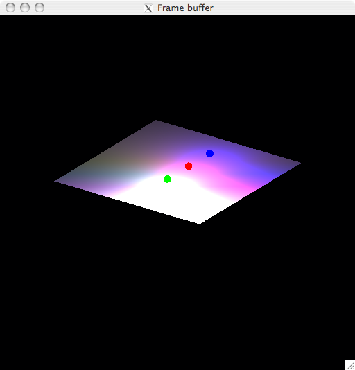
Crank that fraction up to 10.0 and the lights reflected on the top of the box really begin to bloom:
Note that there is so much overlap between the lights at that point, so you see blue for the farthest light, a pinkish magenta color in the middle where blue and red are cross, and white where all three colors are overlapping.
The Phong "Plastic" Shader
Now, at first thought, you may think that the lights are facing forward but they are in face facing straight downward (with a 180 degree angle). Or you may ask why the lights aren't evenly blending together with a white bloom near the center and under the red light. The reason has to do with the material properties (the shader) of the box itself. It's using a default plastic shader. That shader controls how light interacts with the box including how light is reflected, refracted, absorbed, etc.
BRL-CAD's plastic shader is a basic "Phong" shader and provides parameters that let you describe objects with a wide variety of representative optical characteristics. With the right values to the shader, you can give the appearance for a variety materials including glass, metals, mirrors, and others in addition to a simple "plastic" appearance that the default values provide.
Two parameters, specular and diffuse reflectivity, are particularly important for plastic (a.k.a phong) objects as they control how much of a light returns back towards the viewer. By default, 70% of light hitting a phong surface will be specular and biased back towards a viewer. The remaining 30% of the light is considered diffuse and reflects less sharply towards the viewer.
Tweaking the Box
If we move the spherical light sources a little bit closer to the box's surface, we can emphasize the effects of diffuse and specular reflectivity:
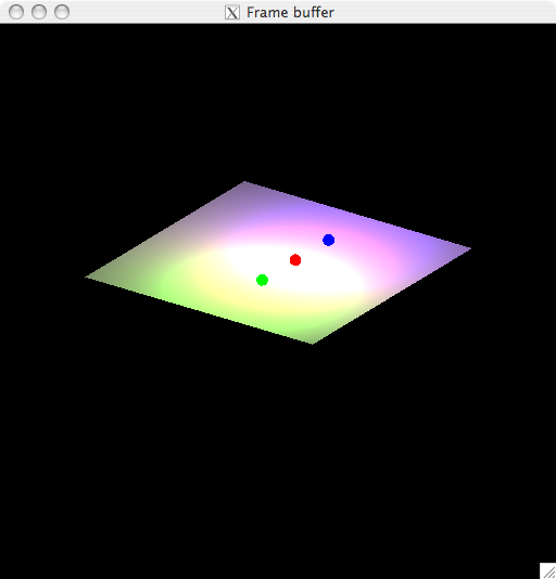
The default ratio of specular-to-diffuse is 7:3 or 70% going towards specular and 30% towards diffuse reflectivity. If we balance the two out, decreasing specular and increasing diffuse reflectivity, the surface becomes slightly more 'dulled' and with our (high-powered, high fraction) lights, we see even more overlap and blending of colors.
Taking that to an extreme with only diffuse reflectivity, the light hitting the surface becomes very spread out:
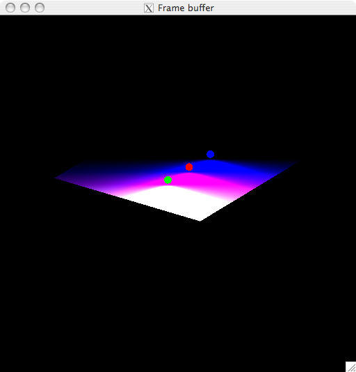
Taking it to the opposite extreme with only specular reflectivity, each light harshly reflects back off the surface and the "forward-blending" of colors becomes rather apparent:
Topping it all off
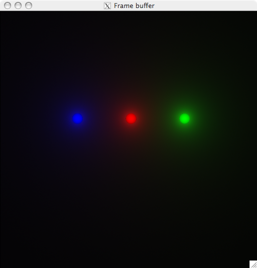
In the simple example scene we are using, if we look at the scene from directly above the three spheres, specular reflectance is no longer a concern and we can see that the lights indeed do reflect straight down. Here they are seen with a default 1.0 fraction and no ambient lighting:
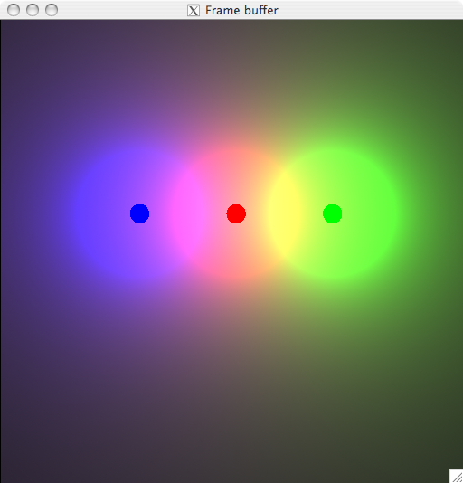
If we increase the light intensity contribution (i.e., its fraction) by an order of magnitude to 10.0 then the colors begin to overlap considerably:
Notice in particular the optical illusion of a bright halo around each light caused by how the three lights are overlapping and how you can begin to see a combined "white" underneath the red light where all three are combining. The halo effect is where the light being reflected from the surface reaches a maximum intensity (255) for that given component and the contribution of the neighboring colors continues to increase (which seems darker but is actually brighter).
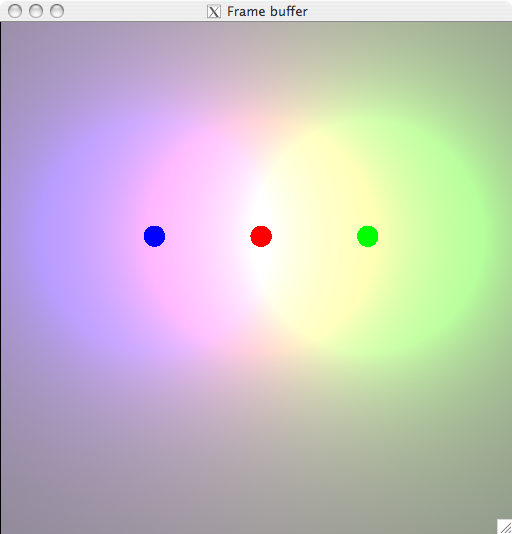
If the fraction is increased even further still, the center white becomes even more pronounced and the color overlap becomes considerable:
