Difference between revisions of "Logo"
From BRL-CAD
(update to current best quality version of the new logo) |
|||
| Line 1: | Line 1: | ||
= Official logo criteria = | = Official logo criteria = | ||
* Color: Dark gray left link, ruby red right link, white pins. Similar to those in our sticker design (see below). | * Color: Dark gray left link, ruby red right link, white pins. Similar to those in our sticker design (see below). | ||
| − | * Pins: | + | * Pins: < 75%, > 50% -- should be around 61.8% ;-) |
* Links should be the same size (balanced), horizontally even, and angled ~90 degrees | * Links should be the same size (balanced), horizontally even, and angled ~90 degrees | ||
| + | * Should contain white pins. | ||
* No artifacts or discontinuities (should be smooth all around) | * No artifacts or discontinuities (should be smooth all around) | ||
= Variations = | = Variations = | ||
| − | |||
* Left link can be black to light grey in color | * Left link can be black to light grey in color | ||
| − | * Sans serif BRL-CAD text | + | * White pins can be grey, but should be lighter than the left link. |
| + | * May be accompanied with or without Sans serif "BRL-CAD" text | ||
* Can be B&W, flat color, or shaded color | * Can be B&W, flat color, or shaded color | ||
| − | = | + | = Current Logo = |
| − | + | http://brlcad.org/img/logo_color.png | |
| − | |||
| − | |||
| − | |||
| − | |||
| − | |||
| − | |||
| − | |||
| − | |||
| − | |||
| − | |||
| − | |||
| − | |||
| − | |||
| − | |||
| − | |||
Latest revision as of 23:11, 1 December 2016
Official logo criteria[edit]
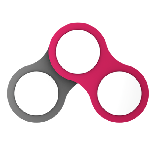
- Color: Dark gray left link, ruby red right link, white pins. Similar to those in our sticker design (see below).
- Pins: < 75%, > 50% -- should be around 61.8% ;-)
- Links should be the same size (balanced), horizontally even, and angled ~90 degrees
- Should contain white pins.
- No artifacts or discontinuities (should be smooth all around)
Variations[edit]
- Left link can be black to light grey in color
- White pins can be grey, but should be lighter than the left link.
- May be accompanied with or without Sans serif "BRL-CAD" text
- Can be B&W, flat color, or shaded color
Current Logo[edit]
